PREVIEW

Step 1 : Choosing the Background Color
Select your background color which should be anything dark of some sort. This will be the base color of your text (which we'll tackle later) but lighter in color. For the purpose of this tutorial, we will choose a dark, brownish-red (#360d10) to a bit lighter one (#5e2929) Linear Gradient. So, make a new document and apply the said linear gradient fill.
Step 2 : Creating the Text
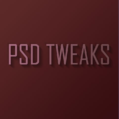
Select a font with sharp edges, bold and condensed. Agency FB is used here but I guess there are other fonts out there which are equally good and more thicker. This would make better effects when light and shadows is applied. Have some browsing on this type so you could find one as an alternative. Use #ac7086 as your font color. When you've finally decided which font to use, type the text you want. You can resize it and position at the center of the canvas. Make sure they are big enough but not too crowded.
Step 3 : Applying Gradient to Text
Ctrl-click the text layer we just created then make a new layer above it. With the selection still on, apply a Linear Gradient diagonally from bottom right to left upward, using the color #6b4648 to transparent. This would result to a dark-to-light shade on the text, exactly what we'd like to do. Note that the light comes from the top left, thus the shadow that would be made appears on the bottom left.
Step 4 : Making the Text Shadows
Time to make the text shadow. Set your foreground color to black by pressing D on your keyboard to restore the default settings. Now, Ctrl-click the text layer again and make a new layer beneath it. Press the down arrow on your keyboard once and the right arrow once also. Press Alt-Backspace to fill the selection with black. To bring the shadow thicker, repeat the process by pressing the down and right arrows several times, about 15 or more. Make sure that a Marquee Tool (any one of them) is selected first before proceeding after the first step is done, or else, you would just be filling the same selection repeatedly with no changes at all.
Step 5 : Adjusting the Shadows
- Still on the shadow layer, press Ctrl-D to deselect. Apply Motion Blur (Filter>Blur>Motion Blur...) and use the values -45 degrees and 30px distance.
- Set your shadow layer to Multiply and about 40% Opacity and then hold down Shift and press the down arrow and then the right arrow one more time. This will move your object right and down 10px each (Shift tells Photoshop to go 10px at a time instead of 1). Now you may have some of the blurred parts of the shadow sticking out to the top and left of the object. If this is the case, grab a small soft eraser and gently erase away anything which shouldn’t be shaded. Take note that the source of light comes from the top left so, naturally, there would be no shadows on the top of the text, right?
- Next duplicate the shadow layer, hold Shift and move it down and right again. Then run the Motion Blur filter again with a distance of 50px this time and set this layer to Multiply and 20% Opacity. This is just to give our shadows more of a trail off.


Step 6 : Text Highlight
- Create a new layer above all the other layers, hold down Ctrl and click the main text layer to select its pixels and back on your new layer, fill the selection with White. Don’t let go of the selection just yet though. Instead, press down and right one time to move 1px away and then hit Delete. Set this thin white line layer to about 80% Opacity.
- You'll notice now that the thin white line gives a sort of highlight effect where the light source is hitting the text and gives the impression that the text is more three dimensional.


Step 7 : Creating Streams of Light
- This time, we will create some streams of natural light. Make a new layer above all the others and draw four or five white rectangles via the Rectangular Marquee Tool approximately similar to those shown (i.e. getting fatter as they go down).
- Now press Ctrl+T to transform and rotate and enlarge the rectangles as shown. Now normally you’d press Enter when you’re finished, but this time don’t let go just yet. Instead, right-click and you will get a pop up menu showing you other types of transforms you can do. Choose Perspective. The reason it’s important to do this in one step is so that you don’t lose your bounding box. So take the top left two points and bring them closer together so that the light appears to be coming from one place and spreading out.
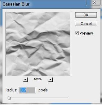
- Here we have our four strips of "light." Now set the layer to Overlay and 20% Opacity and then go to Filter > Blur > Gaussian Blur and give it a blur radius of 6px.
- The result should now look something like this:

- Now since those thin strips are meant to be light, it would make sense if our highlight layer only showed up where the light was hitting right? So Ctrl-click the light layer and then click on the highlight layer from earlier, then while the selection is still on, click on the Add Layer Mask button (it’s the one at the bottom of the layer palette to the right of the ‘f’ icon). This will create a Mask that only shows the highlight layer where the light overlaps it.
- You could stop here now actually. It’s already looking pretty good, but we’ll finish this effect off by adding some warm lighting.


Step 8 : Adding Warmth
- First of all, create a new layer just above the background and fill it with a pinkish color – #a64848.
- Now set the pink layer’s blending mode to Colour and the opacity to 20%. This gives our background a nice reddish-warmth. Over the top of this we can now mix in some yellows. If we don’t put in the reddish cast underneath, the result comes out looking overly yellow and not particularly real.
- Next we create a layer just above the pink. Fill it completely with white and then go to Filter > Render > Lighting Effects. I don’t often use Lighting Effects, but it does have one very cool preset called the Two O’clock Spotlight, which you can select by going to Style at the top and looking through the options. You can pretty much use this as default, but for our purposes it helps to extend the ellipse to make it a little longer (i.e. the spotlight is a little further off).
- Now we set the lighting layer to Overlay and you have something like shown below. Now duplicate that layer, move it above all the other and set it to 40% Opacity. This makes sure that our warm lighting is also interacting with the text and not just the background.


CONCLUSION
Finally, we duplicate the top lighting layer one more time and set it to 65% Opacity, then click the Add Layer Mask button on the layers palette again and draw a linear white to black gradient from top left to bottom right. This makes the extra lighting layer fade off as it goes down right. By the way, here's our layers palette looks like at the end: