Showing posts with label layer styles. Show all posts

Friday, February 22, 2013

How to Watermark Your Photos

More and more people are browsing the internet everyday, searching for photos or images they can use for whatever purpose they have in mind. Published photos online without any security at all are prone to theft or hacking activities. Although putting a watermark to one's photos may not eradicate stealing, it may prevent it nevertheless. Making a watermark is so simple and easy with this tutorial. In less than 5 minutes, you'll be able to create a cool-looking transparent text which can be used as your watermark.

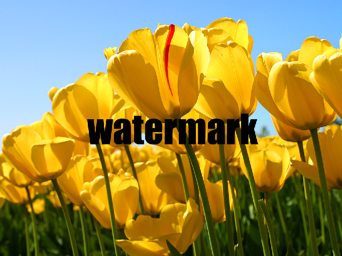
Preview

Steps:

  1. Open your photo
  2. Open your photo or any image in Photoshop that you want to put a watermark into it. For this tutorial, we'll use the tulips photo from Windows sample pictures.
  3. Choosing and Making Your Watermark
  4. Choose the font and type the text you want, if you prefer it to be a text. You can also use a logo or sketch. This will serve as your watermark. In this tutorial, we'll use the text, font Impact. I use this font (e.g., Impact) for this purpose because it is bold and clearly visible even with the transparency effect.
  5. Applying Layer Style
  6. A watermark should look less visible than the photo itself so as not to be the center of focus. Usually, most photographers and graphic artists put their watermark below the photo - right or left part. Some though put it on the center, and others put it everywhere filling the whole picture. It's up to one's preferences actually. Whatever it is, I found it more interesting to make a transparent watermark for any photo. Here's how to do it...
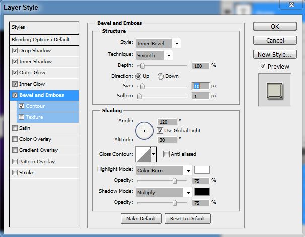
  • Apply Bevel and Emboss
  • Set Fill to 0
You can drag the text wherever you want to place it on your photo, and you;re done!

Monday, July 30, 2012

Chrome Text Effect in Photoshop


Chrome Text Effect in Photoshop


Here’s an easy, cool chrome text effect everybody can learn in just a few steps mainly using the layer styles. Here’s the preview of our final result – a Softlight and Screen blend mode, respectively:


Background Preparation
1. Open a new document (800widthx600height), fill it with black.

2. Pick your Brush Tool (soft) and paint canvass in dots, horizontal arrangement, with the following colors:


3. Apply Gaussian Blur with the following settings:

Done with the background.
Making the Text
1. Select a clean, bold font that is clearly visible with the effects that we’ll make. I use a Neuropol font here, size 72 pixels. Type the text onto the background we made earlier. This is how it looks:

2. Duplicate this layer if you want to. If not, it’s ok.
Applying Layer Styles
1. Right-click your text layer on the layers palette and select Blending Options. In the dialog box that opens, check Drop Shadow, Inner Shadow, Inner Glow, Outer Glow, and Bevel and Emboss.
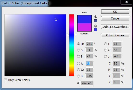
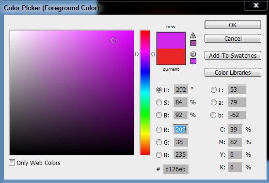
2. Done selecting the layer styles above, it’s time to set the values in each layer style. To do this, click each layer style one at a time beginning with the Drop Shadow up to Bevel and Emboss (in order), then set the following accordingly:


Now, go to your layers palette and change blend mode from Normal to your desired taste. There’s a lot of possibilities here, actually. In this case, I just chose 2 – Softlight and Screen. Save.
Options
You can change the background you want. With the final image above, just paste it onto the background you selected, then choose the mode that blends well with your text. Here is another version of the above by changing the background and Blend Mode:

Overlay (Opacity : 100, Fill : 100)

Color Burn (Opacity : 70, Fill : 50)
That’s it! Enjoy!