Sunday, February 23, 2014

3D GOLD TEXT EFFECT IN PHOTOSHOP

Those who have a PC a bit old as mine and incapable of loading a graphic card and other add-ons or plug-ins for their Photoshop program, aiming for a 3D rendering project can be frustrating and one can really feel so helpless. For text effect and typography though, one can do the job with little creativeness and learning from other graphic designers.

In this tutorial, you'll be able to learn how to make a simple 3D text effect. From here, after going through the steps, you can already create actually a more beautiful 3D text, like applying perspectives, distorts, font designs or typography,layer styles, and more which you can call it your own!

What we are going to make

Step 1. Choosing your background

Since we are creating a gold text, it is therefore more effective to use a contrasting color. For,this, you can use black or other dark colors, and white or nearly similar light color. In this tutorial, I used black.

Step 2. Type the text

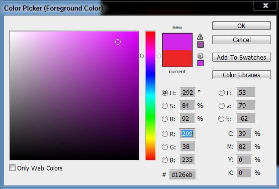
Choose a font that is bold, serif or sans serif, then type the text that you want. I used a Century Gothic here, size 100, and set to Crisp anti-aliasing method. Color is #be9227. When done, rasterize type to enable the layer for further editing.

Step 3. Make a 3D effect

With the text layer active, click the Move Tool icon, then press and hold Alt key while pressing the Up and Down arrow keys each. Do this 18 times (or 9 pairs). Highlight all these copies (except the original), then merge layers.

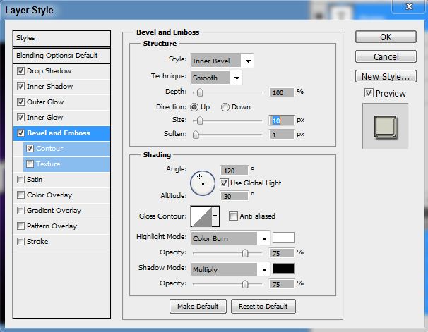
Step 4. Apply layer styles

Press Ctrl and click the merged text layer icon to select, then apply Gradient Overlay. Press Ctrl+D to deselect when done. To reveal the 3D text, drag this layer (merged text) below the original text layer. Here's how it should look now:

Step 5. Final touches

To make the text standout even more, apply Stroke to the original text layer, size 1 and spread to about 3. And to enhance the glow effect, we have to make a reflection of the text. To do this, merge the 2 text layers first, duplicate it, then with the duplicate layer active, go to Edit>Transform>Flip vertical...Drag the text below the original (or you may use the Down Arrow key to move it down) like the one shown below.

Grab your Rectangular Marquee Tool, make a selection that covers half of the whole image, making sure it reaches till the bottom of the original text. Now, with the use of a round soft brush in low opacity, brush off the bottom part with the upper part hardly visible. An alternative way to do this is to apply a gradient overlay of black and white shade. Or, you may also apply layer mask then erase parts by a soft black brush.

And to finish it off, try to make another background, like a brushed metal maybe, or anything you wish to apply other than your black background. Here, I used a carbon BG.

Friday, February 22, 2013

How to Watermark Your Photos

More and more people are browsing the internet everyday, searching for photos or images they can use for whatever purpose they have in mind. Published photos online without any security at all are prone to theft or hacking activities. Although putting a watermark to one's photos may not eradicate stealing, it may prevent it nevertheless. Making a watermark is so simple and easy with this tutorial. In less than 5 minutes, you'll be able to create a cool-looking transparent text which can be used as your watermark.

Preview

Steps:

  1. Open your photo
  2. Open your photo or any image in Photoshop that you want to put a watermark into it. For this tutorial, we'll use the tulips photo from Windows sample pictures.
  3. Choosing and Making Your Watermark
  4. Choose the font and type the text you want, if you prefer it to be a text. You can also use a logo or sketch. This will serve as your watermark. In this tutorial, we'll use the text, font Impact. I use this font (e.g., Impact) for this purpose because it is bold and clearly visible even with the transparency effect.
  5. Applying Layer Style
  6. A watermark should look less visible than the photo itself so as not to be the center of focus. Usually, most photographers and graphic artists put their watermark below the photo - right or left part. Some though put it on the center, and others put it everywhere filling the whole picture. It's up to one's preferences actually. Whatever it is, I found it more interesting to make a transparent watermark for any photo. Here's how to do it...
  • Apply Bevel and Emboss
  • Set Fill to 0
You can drag the text wherever you want to place it on your photo, and you;re done!

Monday, January 7, 2013

Lights and Shadows

It's quite a long time that I hadn't had time making some typography stuff. I was inspired again actually seeing simple yet awesome typographic work across the web, thus this tutorial that I'll share now. This is largely credited to Collis where I based this tutorial. It's kinda basic to me but I found it solid how it is treated and looks very impressive. Just follow step-by-step and you'll know why at the end.

PREVIEW

Step 1 : Choosing the Background Color

Select your background color which should be anything dark of some sort. This will be the base color of your text (which we'll tackle later) but lighter in color. For the purpose of this tutorial, we will choose a dark, brownish-red (#360d10) to a bit lighter one (#5e2929) Linear Gradient. So, make a new document and apply the said linear gradient fill.

Step 2 : Creating the Text

Select a font with sharp edges, bold and condensed. Agency FB is used here but I guess there are other fonts out there which are equally good and more thicker. This would make better effects when light and shadows is applied. Have some browsing on this type so you could find one as an alternative. Use #ac7086 as your font color. When you've finally decided which font to use, type the text you want. You can resize it and position at the center of the canvas. Make sure they are big enough but not too crowded.

Step 3 : Applying Gradient to Text

Ctrl-click the text layer we just created then make a new layer above it. With the selection still on, apply a Linear Gradient diagonally from bottom right to left upward, using the color #6b4648 to transparent. This would result to a dark-to-light shade on the text, exactly what we'd like to do. Note that the light comes from the top left, thus the shadow that would be made appears on the bottom left.

Step 4 : Making the Text Shadows

Time to make the text shadow. Set your foreground color to black by pressing D on your keyboard to restore the default settings. Now, Ctrl-click the text layer again and make a new layer beneath it. Press the down arrow on your keyboard once and the right arrow once also. Press Alt-Backspace to fill the selection with black. To bring the shadow thicker, repeat the process by pressing the down and right arrows several times, about 15 or more. Make sure that a Marquee Tool (any one of them) is selected first before proceeding after the first step is done, or else, you would just be filling the same selection repeatedly with no changes at all.

Step 5 : Adjusting the Shadows

  • Still on the shadow layer, press Ctrl-D to deselect. Apply Motion Blur (Filter>Blur>Motion Blur...) and use the values -45 degrees and 30px distance.
  • Set your shadow layer to Multiply and about 40% Opacity and then hold down Shift and press the down arrow and then the right arrow one more time. This will move your object right and down 10px each (Shift tells Photoshop to go 10px at a time instead of 1). Now you may have some of the blurred parts of the shadow sticking out to the top and left of the object. If this is the case, grab a small soft eraser and gently erase away anything which shouldn’t be shaded. Take note that the source of light comes from the top left so, naturally, there would be no shadows on the top of the text, right?
  • Next duplicate the shadow layer, hold Shift and move it down and right again. Then run the Motion Blur filter again with a distance of 50px this time and set this layer to Multiply and 20% Opacity. This is just to give our shadows more of a trail off.

Step 6 : Text Highlight

  • Create a new layer above all the other layers, hold down Ctrl and click the main text layer to select its pixels and back on your new layer, fill the selection with White. Don’t let go of the selection just yet though. Instead, press down and right one time to move 1px away and then hit Delete. Set this thin white line layer to about 80% Opacity.
  • You'll notice now that the thin white line gives a sort of highlight effect where the light source is hitting the text and gives the impression that the text is more three dimensional.

Step 7 : Creating Streams of Light

  • This time, we will create some streams of natural light. Make a new layer above all the others and draw four or five white rectangles via the Rectangular Marquee Tool approximately similar to those shown (i.e. getting fatter as they go down).
  • Now press Ctrl+T to transform and rotate and enlarge the rectangles as shown. Now normally you’d press Enter when you’re finished, but this time don’t let go just yet. Instead, right-click and you will get a pop up menu showing you other types of transforms you can do. Choose Perspective. The reason it’s important to do this in one step is so that you don’t lose your bounding box. So take the top left two points and bring them closer together so that the light appears to be coming from one place and spreading out.
  • Here we have our four strips of "light." Now set the layer to Overlay and 20% Opacity and then go to Filter > Blur > Gaussian Blur and give it a blur radius of 6px.
  • The result should now look something like this:
  • Now since those thin strips are meant to be light, it would make sense if our highlight layer only showed up where the light was hitting right? So Ctrl-click the light layer and then click on the highlight layer from earlier, then while the selection is still on, click on the Add Layer Mask button (it’s the one at the bottom of the layer palette to the right of the ‘f’ icon). This will create a Mask that only shows the highlight layer where the light overlaps it.
  • You could stop here now actually. It’s already looking pretty good, but we’ll finish this effect off by adding some warm lighting.

Step 8 : Adding Warmth

  • First of all, create a new layer just above the background and fill it with a pinkish color – #a64848.
  • Now set the pink layer’s blending mode to Colour and the opacity to 20%. This gives our background a nice reddish-warmth. Over the top of this we can now mix in some yellows. If we don’t put in the reddish cast underneath, the result comes out looking overly yellow and not particularly real.
  • Next we create a layer just above the pink. Fill it completely with white and then go to Filter > Render > Lighting Effects. I don’t often use Lighting Effects, but it does have one very cool preset called the Two O’clock Spotlight, which you can select by going to Style at the top and looking through the options. You can pretty much use this as default, but for our purposes it helps to extend the ellipse to make it a little longer (i.e. the spotlight is a little further off).
  • Now we set the lighting layer to Overlay and you have something like shown below. Now duplicate that layer, move it above all the other and set it to 40% Opacity. This makes sure that our warm lighting is also interacting with the text and not just the background.

CONCLUSION

Finally, we duplicate the top lighting layer one more time and set it to 65% Opacity, then click the Add Layer Mask button on the layers palette again and draw a linear white to black gradient from top left to bottom right. This makes the extra lighting layer fade off as it goes down right. By the way, here's our layers palette looks like at the end:
And here's our final image as we expected:

Friday, September 21, 2012

Colorful Image Text Effect

PREVIEW
In this tutorial, we’re going to make a typographic poster from a simple photo using Photoshop techniques. I haven’t done something like this before despite the fact that I started doing typography both in GIMP and Photoshop. Filling out an image with different fonts appears so cool to me and it inspires me to do one. The described effects look nice on portraits or any other images with good contrast and light background, but you can easily adjust the contrast and make the background lighter using the different tools and filters in Photoshop. Click here to view my complete tutorial.

Tuesday, July 31, 2012

Wrinkled Text Using Displacement Map

Preview of the Final Result
In this tutorial you will be able to learn how to use the displacement map in making an interesting text effect. You'll discover how the text goes along with the wrinkle of the paper, and it's another idea you'll surely add to your arsenal of knowhow in Photoshop text effects.

Step 1 : Open the image you’ll be using for the text. Here, we’ll be using the wrinkled paper texture below. You can download the image HERE.
Step 2 : Go to the Channels palette and select which of the RGB has the greatest contrast. In this case, I selected the Green channel which gives the best result. Duplicate this channel by right-clicking it and select Duplicate Channel. A Duplicate Channel dialog box appears. Name the duplicate channel as Map, and under Document, select New.
Step 3 : The new image that appears as a result is a black and white. We will use this as our displacement map. Smooth this via the Gaussian Blur (Filter>Blur>Gaussian Blur…), and set the blur value to 0.7 pixel. Save this to your hard drive and name it Map.psd. Close this image for now.
Step 4 : Switch back to Channels. Click RGB to activate it. Now go to Layers tab and then select the Type Tool. Step 5 : Type the text you want. I typed WRINKLED here. A new layer will be seen in the layers palette as a result (named WRINKLED). Right-click this layer and select Rasterize.
Step 6 : Time to apply the displacement stuff. Go to Filter>Distort>Displace… A dialog box appears. Leave all the values to their default settings and click Ok. You will then be prompted to open a file. Open the file we saved earlier (e.g., Map.psd). The Displacement Map has been applied here and a wrinkled text comes into view!
Step 7 : Duplicate the above layer, set Mode to Overlay, and Opacity to 70. Merge all visible layers, then Save. Here’s the final result as shown at the start:

Monday, July 30, 2012

Chrome Text Effect in Photoshop


Chrome Text Effect in Photoshop


Here’s an easy, cool chrome text effect everybody can learn in just a few steps mainly using the layer styles. Here’s the preview of our final result – a Softlight and Screen blend mode, respectively:


Background Preparation
1. Open a new document (800widthx600height), fill it with black.

2. Pick your Brush Tool (soft) and paint canvass in dots, horizontal arrangement, with the following colors:


3. Apply Gaussian Blur with the following settings:

Done with the background.
Making the Text
1. Select a clean, bold font that is clearly visible with the effects that we’ll make. I use a Neuropol font here, size 72 pixels. Type the text onto the background we made earlier. This is how it looks:

2. Duplicate this layer if you want to. If not, it’s ok.
Applying Layer Styles
1. Right-click your text layer on the layers palette and select Blending Options. In the dialog box that opens, check Drop Shadow, Inner Shadow, Inner Glow, Outer Glow, and Bevel and Emboss.
2. Done selecting the layer styles above, it’s time to set the values in each layer style. To do this, click each layer style one at a time beginning with the Drop Shadow up to Bevel and Emboss (in order), then set the following accordingly:


Now, go to your layers palette and change blend mode from Normal to your desired taste. There’s a lot of possibilities here, actually. In this case, I just chose 2 – Softlight and Screen. Save.
Options
You can change the background you want. With the final image above, just paste it onto the background you selected, then choose the mode that blends well with your text. Here is another version of the above by changing the background and Blend Mode:

Overlay (Opacity : 100, Fill : 100)

Color Burn (Opacity : 70, Fill : 50)
That’s it! Enjoy!